Google’s visual identity has long been a subject of intense debate within the design community. From the early days of simple skeuomorphism to the 2014 Material Design revolution, the tech giant has consistently sought to balance simplicity with brand recognition. However, the major overhaul in 2020, which mandated a uniform four-color palette (blue, red, yellow, green) across all icons within white circular frames, created an unintended consequence: visual homogeneity that led to widespread user confusion. Now, in 2026, Google appears to be correcting this course by expanding its new gradient-based design across its entire application ecosystem.
The Failure of the 'Four-Color Rainbow' and the Need for Distinction
For years, users have complained that Google’s apps — from Gmail and Drive to Calendar and Meet — looked far too similar. When every icon shares the same shape and the same four colors in roughly the same proportions, cognitive load increases. A user can no longer identify an app with a split-second glance at their home screen. They must pause and process the internal shape, a friction point that violates the fundamental principles of UX (User Experience) design.
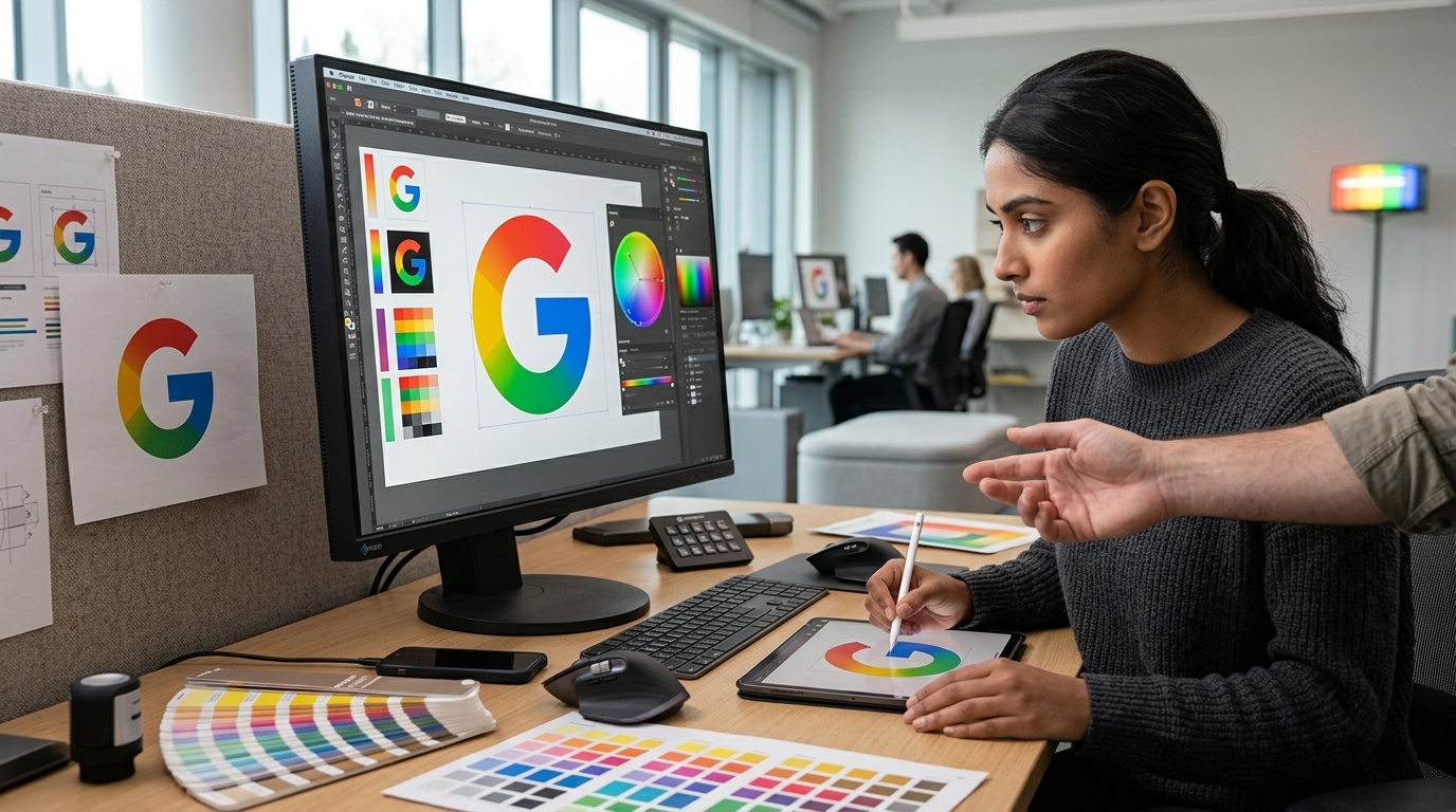
The new approach, as detailed by recent leaks and reports from 9to5Google, signals a shift toward geometric freedom. The new icons abandon the strict circular container and embrace bold color gradients. For instance, the Google Drive icon no longer attempts to cram the entire corporate color spectrum into every corner. Instead, it utilizes shades of blue and green with subtle shadows that provide depth, making it instantly distinguishable from the red-orange hues of Google Photos.
The Psychology of Gradients in the Digital Age
Why gradients, and why now? The use of gradients isn't merely an aesthetic fad; it is a return to visual depth. After a decade of 'flat design' dominance, the industry has rediscovered that the human eye fatigues when faced with a lack of dimension. Gradients allow an icon to feel more 'tactile,' almost three-dimensional, without regressing into the excessive skeuomorphism of the early 2010s. This style, often categorized under 'Neumorphism' or 'Glassmorphism,' offers a sense of premium quality and modernism that aligns perfectly with the high-resolution capabilities of modern OLED displays.
- Improved Legibility: Colors act as signals. Dominating an icon with a primary color family aids user muscle memory.
- Synergy with Material You: The new design language integrates more fluidly with Android’s dynamic color system, which adapts the UI based on the user's wallpaper.
- Brand Maturation: Google is signaling an evolution, moving away from the 'playful' primary color aesthetic toward a more sophisticated, professional look.
Strategic Implications for Android and Workspace
This shift is about more than just icons; it’s about survival in a landscape where competition from Apple and Samsung remains fierce. Apple has always maintained a strong visual hierarchy in its iOS icons, while Google seemed trapped in an ideological obsession with its primary branding. With this move, Google is silently admitting that utility must take precedence over brand dogmatism.
Furthermore, within the Google Workspace environment, where professionals spend hours daily, the ability to switch rapidly between Docs, Sheets, and Slides is critical. The new gradients provide the visual 'hook' that was previously missing. As AI (Gemini) becomes deeply embedded in these apps, the new design prepares the ground for an era where software isn't just a tool, but a digital partner with its own distinct, recognizable identity.
Conclusion
Google’s decision to expand gradient icons is a victory for common sense over dogmatic design. In a world saturated with digital distractions, anything that reduces the time required to find what we need is a welcome improvement. Google finally seems to understand that its logo doesn't need to be plastered in its entirety on every single app for the brand to be recognizable. The essence of a brand lies in the experience it provides, not just the colors it uses.